
What is Responsive Web Design?
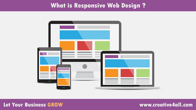
Responsive web design changes a website’s resolution so that it looks good on all screen sizes and all devices. This responsive web design is achieved through the use of easy layouts and media queries.
The method of responsive web design is not a new method, it has been around since a long period of time, but business owners everywhere are still failing to see the benefits of responsive web design.
We will now go over some of the improvements and benefits responsive web design can bring you in details.
Smartphones And Their Users
If someone doesn’t own a smartphone in the world of today… What are they doing with their daily lives?!!
77% of adults nowadays own a smartphone.
We use our power points and experience for a variety of tasks like GPS, calling, texting, accessing social media and more every day.
Did you know that in 2018, at least 50% of e-commerce income came from mobile sales?
It is the age of smartphones, and if your business is not adapting to these changes then you will lose a lot.
How Often Do People Use the Internet?
Adult smartphone owners tend to use their devices regularly. 69% of them uses internet several times a day and 75% of 18-49 years old uses the internet almost constantly.
Responsive Web Design & Load Times
What most people hate is website’s slow loading! Over 40% of internet users think and believe that websites should load in less than 5 seconds. Every second that goes by, your processing rates can go down almost 7%.
The first step is decreasing your load times through creating a mobile friendly website or in other words a responsive web design.
Smartphone users like to make purchases online. With high percentage of smartphone users using mobile phones to make a purchase in the last 6 months, you will lose most of them if you do not serve them in a fast way. Slow loading is your enemy.
What Google Says?
Google & IPSOS released data stated that 90% of internet users use multiple devices to access the same website.
This means that internet users typically switch from their laptop or desktop to their mobile to view the same website.
You must present all of the information on your website in a correct way on each device so that the user doesn’t face obstacles at all.
Google has also released in their mobile report that 61% of internet users spent their time on a mobile device versus 39% on desktop or laptop.
It is obvious that Google is trying to guide us all to follow their “Mobile First” philosophy.
What The People Want?
It is incredible how far mobile design has come in the recent years. Every year more people use their mobiles to browse the web, and that what we all want, to access information wherever we are as if we are having the same experience of desktop but in the palm of our hands.

