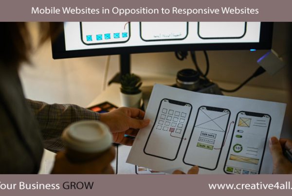
What is Responsive Web Design ?
Responsive Web Design is a group of methods that allow a website to flex and adapt to the size of the screen it’s being viewed on. So anyone opening your website on a small smartphone will be presented the same site as the person opening it on their laptop but the website will have detected the constraints and automatically reformatted to give the user an experience better suited to their device.
The days of loading a huge website and having to zoom in and out to find the content you’re looking for has gone away. Responsive web design takes into account interaction too and makes your website easier to use by recognizing and integrating things like touch screens to aid navigation.
As the web continues to develop it’s becoming ever more clear that the main driver to a website is creating a solid, valuable, and shareable content. Responsive design explores the effects of limited screen real estate and ease of access not only for structure but forces us to consider our messaging and content on-site by adopting a ‘mobile first’ strategy.
Mobile First
Before we used to design for desktop users first, and a mobile version was either a far too minimal functional experience or we were trying to force too much of our desktop site into it needlessly. Determining what is most essential to a viewer on a mobile device with limited bandwidth, processing power and screen size means we get rid of anything reducing our main purpose or message and thus, across all sizes of the site, we are focused and brief in offering an enhanced experience to our customers.
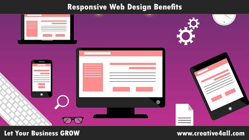
Benefits
So now, we should have over here some of the benefits of responsive web design:
- Search Engine Optimization ( SEO ) Optimized. Managing Search Engine Optimization ( SEO ) for separate mobile and desktop sites is not easy at all and doesn’t harvest great results. Google, in fact, recommends a responsive method to fight these problems and a combined view of your results means more focus.
- Improve Conversion Rates., no matter what platform your website is viewed on, an optimized and consistent site gives a better experience for the user which will lead to them engaging with you than going elsewhere.
- Future Proofing. Responsive websites work very well across the mass of existing devices on the market. It’s a safe future bet.
- Better, Faster, Smarter User Experience. Enhancing your website, no matter what the user chooses to view it on makes their life easier. Satisfied customers mean a successful business.
- Cost Effective. Responsive websites save time and money. Although it takes a little longer to put together, they live longer and the unified line means management, support and upgrades only need be applied to one place.